When you think about the mobile web, the first image
that comes to mind is probably that of the mobile device itself. Owned
and used by more than half the members of the human species, these
incredible devices have already revolutionized the way in which people
stay in touch with each other and are now doing the same to the way in
which they access services on the Internet.
The "humble" mobile device is
really nothing of the sort. Being able to transmit voice, messages, and
data over the air, in almost any part of the populated world, is
nothing short of a modern miracle. Although as users people take their
capabilities and operation for granted on a day-to-day basis, you can't
afford to do so when designing mobile web services for them. Let's look
at the form and function of modern mobile devices and how they impact
the way people think about building web content.
1. Physical Constraints
Pick up any mobile device
and look at it carefully. Of course, the first thing you notice is the
size, shape, and weight of its physical implementation. Very old mobile
devices can be easily recognized by their larger, ungainly form, but
following a period in the 1990s and 2000s, during which manufacturers
sought to develop ever smaller devices, most modern devices are now of
broadly similar size and weight. Not by coincidence, this is about the
size that fits comfortably into an adult hand.
A limited selection of
device form factors tend to prevail in today's mobile market place. Some
are more popular in certain parts of the world than others or among
certain demographic groups, so a conscientious mobile web developer
needs to be aware of all of them. These broad categories include the
following:
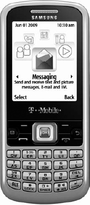
Candybar —
These devices are rectangular and static, typically with the main
screen on the top half of one face and navigational control keys and a
numeric keypad on the lower part of the same face, as with the Samsung
SGH-t349, shown in Figure 1.
This form factor tends to be prevalent for cheaper or legacy models,
although a wider, flatter candybar form, with a larger screen and
complete QWERTY keyboard, is often used for more pricey business
devices, such as the RIM BlackBerry range and some of the Nokia E-Series
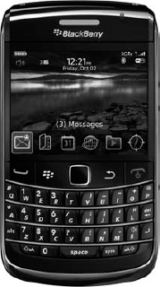
range. Figure 2 shows a BlackBerry Bold 9700 device.
Slate
— These devices are also rectangular and static, but with much larger
screens and fewer physical buttons on the casing than the candybar form
factor. The rise of popularity in slate devices has been largely driven
by improvements in touch-screen technology, which allow for point- and
swipe-based navigation and for numeric and QWERTY keyboards to be
displayed in software. Often, these devices can be rotated between
landscape and portrait mode to maximize screen usage for particular
types of applications. With the advent of the Apple iPhone and
Android-based devices, this form factor has become very popular on
expensive consumer devices, although some mid-range devices are now
exhibiting similar characteristics. Additionally, a larger variant of
the slate form factor, personified by the Apple iPad, Amazon Kindle, and
other tablet devices, is starting to inhabit the space between
pocket-sized mobile devices and laptops, while still being quite
feasible web clients for humans on the move. Figure 3 shows a Google Nexus One running the Android operating system.
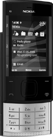
Slider
— These devices are rectangular and of similar proportions to candybar
devices when closed. However, the two halves of the device, one
supporting the screen and one the keyboard, are able to slide relative
to each other. This extends the size of the device and exposes the
keyboard for use. Portrait-style sliders are popular, often on low-end
models, because the longer "open" shape can be easier to use for making
calls. Figure 4
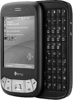
shows a Nokia X3 device with a portrait-style slider. However, many
contemporary handsets slide in a landscape manner, exposing a QWERTY
keyboard to use with a wider screen aspect ratio, as with the HTC P4350
device shown in Figure 5.
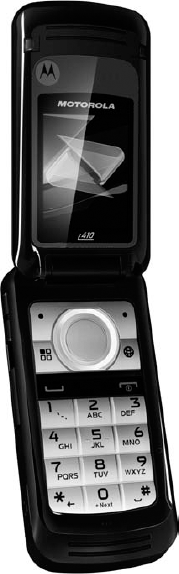
Flip
— These devices also are designed to open up and expose a concealed
keyboard, but do so with a hinge, rather than a slider. As a result, the
primary screen is not visible in the closed state and is generally
smaller as a proportion of the device than for the other form factors.
Some handsets provide a smaller secondary screen on the outside of the
device, but this rarely supports a web browser. Figure 6 shows a Motorola i410 device exhibiting a classic flip form.
Despite all the
differences between these form factors, you need to make some reasonable
assumptions for the purposes of delivering mobile web content to a
capable device. First, you can be fairly sure that the device has a
screen upon which its browser can render your content, but also that it
is fairly small, both physically and in terms of pixel dimensions —
relative to a desktop or laptop screen. Nevertheless, you can't guess
what physical or pixel size the screen actually has without identifying
the device, and because many devices can be rotated, you need to
anticipate both landscape and portrait orientation (and possibly even
the transition between them while the user is viewing your content).
The device certainly has some
sort of keyboard to allow the user to enter data, although it is
unlikely to be as easy to enter text as on a full computer keyboard. At a
minimum it will be a numeric keypad, but using multi-tap or predictive
text techniques the user can still enter alphabetic characters and most
common punctuation. Touch-screen devices offer "soft" keyboards that
almost always support numeric, alphabetic, and punctuation input,
although often by rendering the keyboard over much of the content of the
web page itself. Those devices with QWERTY keyboards make data input
even easier for the user, although some do not provide dedicated numeric
keys. This can make entering mixed alphabetic and numeric text slightly
more difficult and can affect the usability of website password
constraints, for example.
Most devices offer a
navigation technique for scrolling the screen and the content on it, or
for moving the control or cursor focus around the page. Traditionally,
this is simply a physical joystick-like key or a quartet of directional
keys, and such older devices normally provide fairly crude directional
control throughout a web page. Sadly, this is far from the sensitive
interaction that a traditional computer mouse would provide. Devices
with touch screens can provide more precise control over the browser
screen, either through the use of a stylus to tap on form widgets or
scroll bars or, increasingly, by allowing swipe and pinch gestures on
the screen to pan and zoom through the page and its elements.
Now that you feel
confident that mobile devices have at least some common physical — if
highly limited — characteristics, brace yourself for a first look at the
reality of the diversity among them.